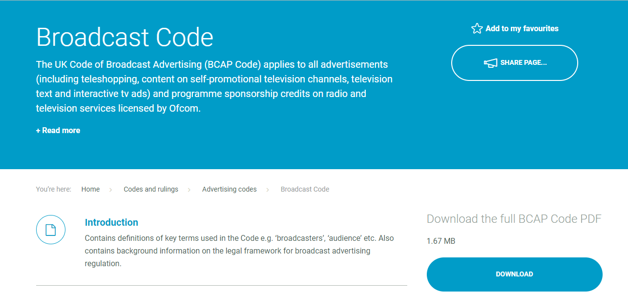
I researched the ASA and BCAP in order to see the rules and regulations that my adverts would have to follow in order for them to be seen as appropriate to air and to prevent my advert from being taken down and therefore become a waste of money.
BCAP
ASA
Key Regulations I Found Important
Through researching the different types of adverts that have and haven’t followed these regulations, I was able to see a range of particularly interesting adverts which are extremely innovative such as the Cadbury Gorilla ad which introduced genre hybridity. I also found that in the BCAP, articles 4 and 10 were particularly useful in helping me see what was an appropriate idea for my adverts and they also pointed out issues that I may have overlooked such as giving the delivery person a helmet. I've embedded above the Cadbury Gorilla Ad that was named advert of the year by Time Magazine and McDonalds' Dead Dad Advert which was bad for being insensitive.
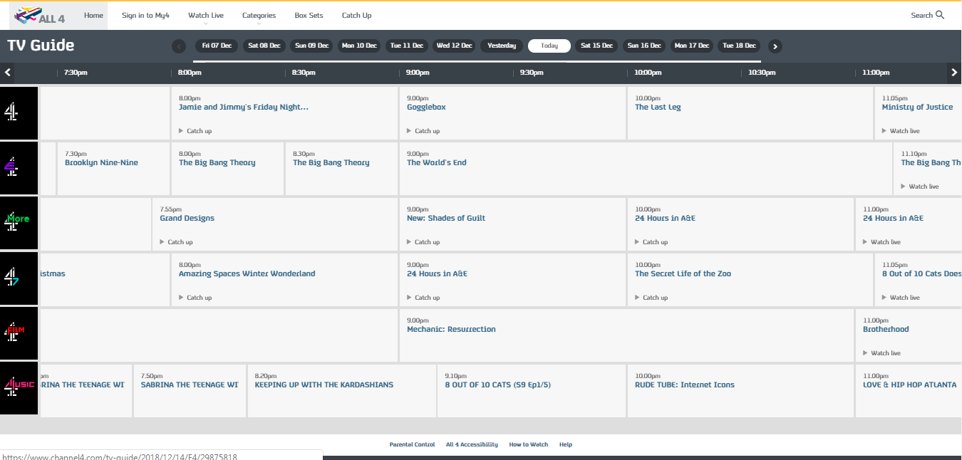
I researched Channel 4 in order to see the style that the Channel has and, therefore the style and types of adverts that they broadcast throughout the week. I'm aware that Channel 4's target audience consists of 18-30 year olds (stated on the PSB Remit) and that my TA are 16-25 year olds which crosses over with Channel 4's demographic. Therefore, I did this in order to see which type of programmed attracted specifically my TA the most in order to see the time in which my advert would have the widest reach.
Channel4 TV Guide for Fridays
Channel4 TV Guides for Tuesday
Channel4 Target Audience
Channel4 Background Information
PSB Remit
Channel4 Scheduling
Channel4 General Statistics
I found this particularly useful to look at each of the programme's ratings and demographics and to look at the TV guide as it gave me a structure to work around and through looking at each show’s ratings I could see which time was most suitable to air the adverts at. I ended up settling on airing the advert at 7pm on a Tuesday between Hollyoaks and Channel4 News and 9pm before Gogglebox on a Friday as all three of those shows have a high demographic of young adult, in particular, university students. I also found out that all the adverts on Channel4 included a shot of the app being used on a smartphone which I kept in mind and used later on in my adverts.
I researched already existing takeaway food delivery services and industries in order to be able to see the conventions that they shared and the USPs that they created in order to attract a wide audience. I researched this by looking at the three most popular food delivery services and looked at their similarities and differences in order to find any missing gaps in the market that YourFood could fill.
The 3 Main Delivery Services I Researched
UberEats 1
UberEats 2
JustEat
Deliveroo 1
Deliveroo 2
Common Designs and Features of All
Summary
Deliveroo Website That I Referred To
JustEat Website That I Referred To
UberEats Website That I Referred To
My research allowed me to come up with an idea for my brand value and the type of USP that I wanted to have in order to attract the TA given in the brief (16-25 male and female). I was particularly inspired UberEats' tracking feature as I found that it was the USP that set it apart from other delivery services and was what made it popular in younger people such as teenagers and young adults who can be busy and/or impatient. I found it particularly useful to look at the delivery service's website and app including their contact us and about us tabs, however, if I couldn't find the information that I had wanted, I resorted to referring to their Wikipedia site.
I think that my cover turned out pretty well with the use of a consistent colour scheme and style and use of key core conventions of magazine covers such as using a focal image, tag line and use of brand logo. I also feel that the style of edit matches that of Big Issue through bright colours, bold font and direct eye contact between the audience and the person in the focal image.
Even Better If:
I feel as though the actual image itself could’ve been edited better to seem more natural. Additionally, I could’ve done more with the blank background that would bring more attention to the focal image. The way I used the Big Issue logo could’ve also been more conventional as they do not alter their logo in any other cover and therefore my version does not fit the Big Issue style and branding.
For the big issue cover I have created, I have tried to emulate and match Big Issue’s style as much as possible. For example, I took reference of the Joe Wicks (issue 1327) cover layout such as having a person as the focal image in the center of the page. Both people have direct eye contact with the audience in order to create direct engagement and address and therefore encourage readers to buy the issue. Despite this, I’ve edited my focal image unlike the other cover. I’ve also chosen to write in a bold font that would catch the readers audience with the theme of the cover as largest font (‘Easter’ and ‘Poverty’). This is done so that the audience will be able to see what the issue will be about and whether or not they would be interested in it’s potential content. I’ve also tried to create a consistent theme in colour and style with the same styles font and red and white as the colour scheme in order to make it look more together. As my colour scheme was red and I had the tag line from ‘rags to riches’ I also included a red jacket to pay homage to the uniform of vendors of the Big Issue. Despite this, I strayed away from the convention of having the Big Issue logo as rectangular and in the corner of the page and instead tried to incorporate it into the clothing.
The trailer that I analysed was the Hannah Montana movie. I chose this as it was one of the first movies to be made from a show from the Disney channel.
The trailer follows trailer conventions such as fast paced editing, intertitles, scheduling information, and telling a story throughout through three parts. However it goes against the expectations of previous Hannah Montana watchers as the settings are completely different to that of those in the sitcom. They are realistic and not built up by the production team however it manages to maintain the Disney style through the rich saturation of colours shown when Miley rides the horse and the grass is a vibrant green.
The large Disney budget is also shown through the expensive looking locations and settings such as a waterfall, the props (a large chicken coop) and the actor cameos (featuring Tyra Banks). This, combined with the great but still classically PG and cheesy Disney style acting from Miley Cyrus builds up audience expectations for a good film.
Finally, the majority of the audience will come from watchers of the TV show, however, more people will be attracted to the coming of act plot, and more from fans of musicals.
1. What was your role in the task and what did you actually do?
I acted in the video and helped write the script whilst the first few scenes were being filmed in order to save time. 2. As a group, what factors did you take into account when planning, filming and editing?
When we were planning, we create a simple storyboard in order to be able to figure out what type of shots we were filming, what sort of actions were going to occur and what sort props we were going to use. This helped us figure out how we were going to film efficiently and maximize our use of time. It also helped the entire group understand what we were doing better and have a clearer idea of the outcome. When we were filming, we used a clapperboard so that later on in edit, it would be easier to find the shots that we needed and therefore save time editing. Additionally, we filmed the full action that the characters would do, such as opening a door, so that the cuts in the edit would be more seamless and wouldn't have pauses or seem awkward. We also refilmed the whole conversation 3 times, abiding by the 180 rule to allow us to have more editing choices. Whilst editing, it was key that we lined up the shots together correctly in order to prevent glitches and maintain flow. This including things such as the door closing when Kush opens the door, when Simon opens the door which bangs shut, and when he walks into the conversation.
3. How successful was your sequence? Did you fulfil the demands of the brief? Did you manage to demonstrate match-on-action, shot-reverse-shot, and 180-degree rule? Did you achieve continuity overall? (WWW/EBI)
I feel like our sequence was successful as we did demonstrate a match-on-action (Kush walking into the room), a shot-reverse-shot (used throughout the conversation), and the 180-degree-rule (also shown from the three angles that the conversation was shot in). Therefore, we achieved continuity overall. Also, we didn't use music, however, we did use it at the end of our second 'fun edit version' which I feel added more suspense and comedic effect.
4. What have you learnt from completing this task? How might this learning impact on future video production work?
From completing this task, I've learnt several techniques in how to achieve continuity which I believe will become very beneficial in upcoming practical tasks. Additionally, as this was also an editing task, unlike the previous task which was shot and cut in camera, I've also been able to refresh myself on how to use the editing software which will help me managed my time whilst editing better.